Introduction: The Hidden Reason Businesses Are Losing Customers Every Day
Most business owners think having a website is enough.
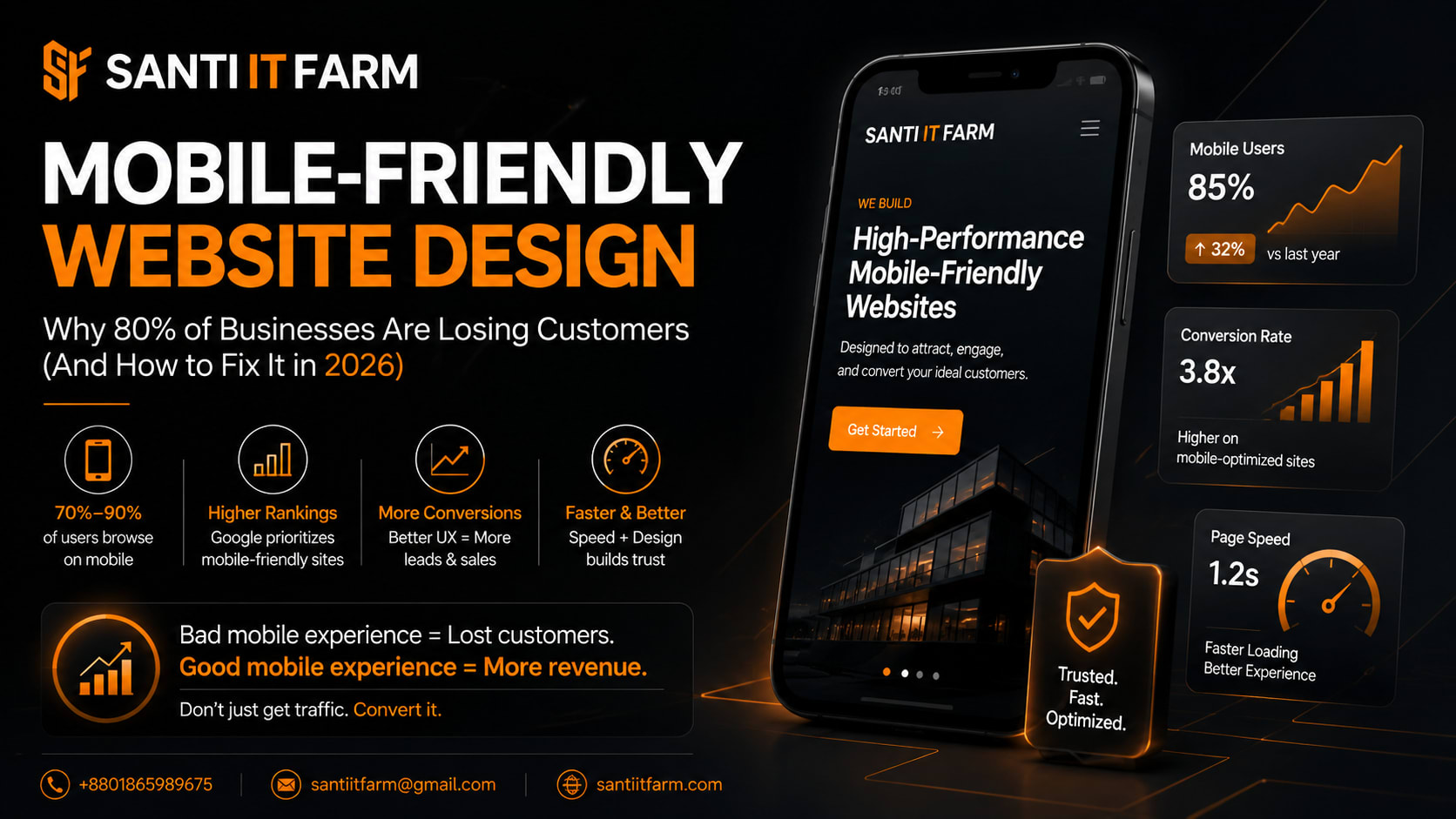
But here’s the reality in 2026: If your website is not mobile-friendly, you are silently losing up to 80% of your potential customers.
Because more than 70%–90% of users now browse, search, and buy using smartphones. If your site loads slowly, looks broken, or is hard to navigate on mobile, users don’t complain—they leave and go straight to your competitors.
This is not a design issue anymore. It’s a revenue problem.
In this guide, you’ll learn exactly why mobile-friendly website design matters, what businesses are doing wrong, and how to fix it to increase leads and sales.
Quick Answer: Why Mobile-Friendly Website Design Matters
- Most customers browse using mobile devices, not desktops
- Poor mobile UX directly increases bounce rate and lost sales
- Google prioritizes mobile-friendly websites in search rankings
- Slow or unresponsive sites reduce trust and credibility
- Businesses with optimized mobile websites convert significantly more visitors into customers
What is Mobile-Friendly Website Design?
Mobile-friendly website design means your website automatically adapts to different screen sizes—especially smartphones and tablets.
A properly mobile-optimized website ensures easy reading without zooming, fast loading speed, clickable buttons without frustration, clean layout on small screens, and smooth navigation experience.
In simple terms: your website should feel like it was built for mobile first, not just resized from desktop.
Why Mobile-Friendly Website Design Matters in 2026
- People search Google while walking, traveling, or shopping
- Customers compare businesses instantly on mobile
- Attention span is extremely low (3–5 seconds max)
- Google uses mobile-first indexing for ranking websites
- If your website is not optimized for mobile, you rank lower, users trust competitors more, ads cost more but convert less, and you lose leads without knowing it
- Bad mobile design = invisible business
Key Benefits of Mobile-Friendly Website Design
Higher Conversion Rate
Users can easily contact, buy, or book services without friction.
Better Google Ranking
Google prioritizes mobile-optimized websites in search results.
Improved User Experience
Visitors stay longer and explore more pages.
Increased Trust & Branding
A clean mobile UI makes your business look professional and reliable.
Faster Loading Speed
Optimized websites reduce bounce rate and improve engagement.
Real Business Example: What Happens Without Mobile Optimization
Before
- — 1,000 visitors land on the website from mobile
- — Website loads slowly and text is hard to read
- — Contact button is not visible or usable
- — Users leave within 5 seconds
- — High ad cost
- — Zero or very low leads
- — Wasted marketing budget
After
- Same 1,000 visitors
- Clean layout + fast loading
- Clear call-to-action buttons
- Easy contact options
- More inquiries
- Higher sales
- Lower cost per lead
The difference is not traffic—it’s design quality.
Step-by-Step Guide to Build a Mobile-Friendly Website
Step 1: Use Responsive Design
- › Your website must automatically adjust to all screen sizes
Step 2: Optimize Page Speed
- › Compress images
- › Use caching
- › Minimize scripts
Step 3: Simplify Navigation
- › Keep menus short and easy to tap
Step 4: Improve Readability
- › Use large fonts
- › Maintain proper spacing
- › Avoid clutter
Step 5: Make Buttons Touch-Friendly
- › CTA buttons should be large and easy to click
Step 6: Test on Real Devices
- › Always test on multiple smartphones before launch
Tools & Technologies Used for Mobile-Friendly Design
These tools ensure responsive, fast, and conversion-focused websites.
Common Mistakes Businesses Make
- Using desktop-only layouts
- Heavy images that slow down mobile
- Small text that’s hard to read
- Hidden or confusing CTA buttons
- Poor mobile navigation menus
- Not testing on real devices
FAQ: Mobile-Friendly Website Design
Conclusion: Your Website is Your First Salesperson
In 2026, your website is not just an online presence—it is your primary sales engine.
If it is not mobile-friendly, fast, and user-focused, you are losing customers every single day without realizing it.
Businesses that invest in mobile optimization get more leads, convert faster, and grow revenue consistently.
Work With Experts Who Understand Conversion-Focused Design
At Santi IT Farm (santiitfarm.com), we specialize in building high-performance, mobile-friendly websites designed to generate real business results—not just look good.
We help businesses build responsive websites, improve Google ranking, increase customer inquiries, and turn traffic into sales.
If you are serious about growing your business online, your website needs to work on every device—perfectly.
- Mobile-friendly website design
- Conversion-focused web development
- SEO optimization
- Business growth systems
Contact Santi IT Farm today and get a mobile-friendly, conversion-focused website that brings real customers.
Get Started

